Category Archives: Internet
Adobe Chicago Generation AI Event

Creativity with AI in Education 2025 Report
I attended the Adobe Chicago Generation AI event this week. Here are some brief notes:
Digital Literacy & Access: University-Wide & Classroom Perspectives
I was particularly impressed by the presentations from Professors Justin Hodgson (Indiana University) and Sheneese Thompson (Howard University), who shared valuable insights on digital literacy initiatives. They discussed both university-wide strategies and classroom-specific approaches for expanding access to Adobe tools. Their practical examples of how these tools can be integrated into diverse educational environments were especially helpful.
- Justin spoke about the Digital Gardener Initiative and shared this resource.
- Sheneese presented using this resource (So I Have Adobe, Now What?) as her presentation materials.
Creativity with AI in Education: 2025 Report
Brian Johnsrud from Adobe delivered a detailed presentation on the 2025 Report focusing on creativity with AI in education.
- Brian shared his report to the web: Adobe AI in Education Report
Future Forward: Reimagining Career Readiness for the Next Generation
Joshua Meredith and Clark Edwards (both from Deloitte) presented on “Future Forward: Reimagining Career Readiness for the Next Generation.” Their analysis of emerging workforce trends recommended that educational institutions need to adapt to prepare students for success in an AI-transformed job market.
- Slides were not shared, but the Deloitte report (Preparing students for an AI-driven workforce and the future of work) was shared.
For Good: Navigating Wicked Problems with Adobe Express and Acrobat AI Assistant
Shauna Chung led a demonstration of Adobe Express and Acrobat AI Assistant, with a hand-on workshop (For Good: Navigating Wicked Problems). Two tools were highlighted as part of the session:
- AI Assistant in Adobe Acrobat: This tool operates as a NotebookLM competitor (without the podcasts). The value proposition Adobe offers here is that your documents are retain their privacy and are not used for training. According to Adobe, OpenAI’s GPT models power the backend. In quick tests, it worked well for me. However, the prompt window had a character limit of about 500 characters. I imagine that the context window for AI Assistant is not as large as NotebookLM’s.
- Adobe Express: I see tacit admission from Adobe that the Creative Cloud tools are intimidating to new users, with a UX that is designed for established users. Adobe Express is positioned as the platform for new and occasional users. The generative AI tools are positioned as more ethical than the competition.
The organizers provided six-months free access to the tools.
Overall, I found the sessions to be very helpful. I hope future events have a dedicated workshop-only option for faculty and staff getting up-to-speed with the tools.
Magic Camera

Magic Camera
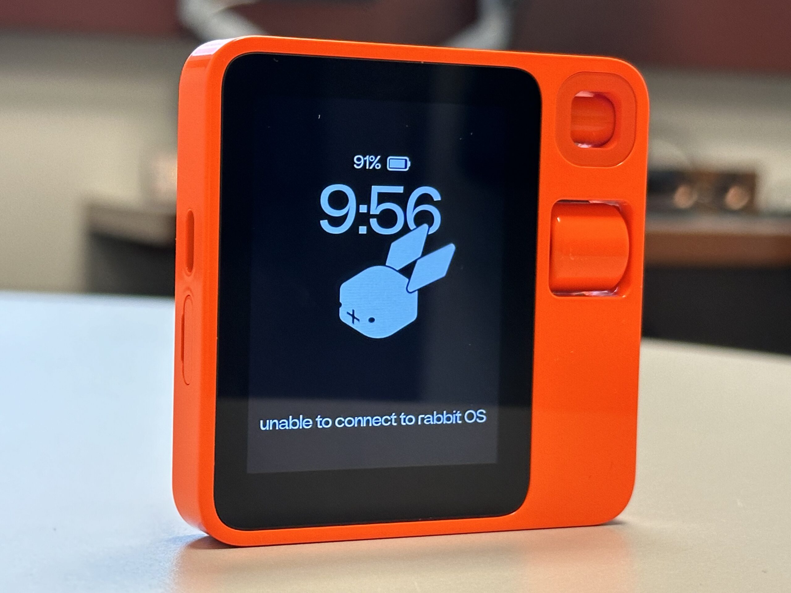
Rabbit R1: First Impressions

Rabbit R1
First impressions of the Rabbit R1 are not great. The industrial design of the device makes me want to love it, but simple tasks fail in ways that quickly frustrate.
In no particular order, here are the stumbles so far.
Website
The Rabbit website looks pleasant, but the company chose a smaller than average font size that is painful to read. Wish they had favored accessibility over looking cool.
WiFi
WiFi currently sucks. The only way I can get back to a previously joined network on the R1 is to forget the saved password. To add insult to injury, tapping away on the virtual keyboard is torturous (small virtual keys, close together). The device supports Bluetooth, but only for speakers and headsets – not Bluetooth keyboards.
Connected Services
Of the four connected services (Music: Spotify, Ride Share: Uber, Food: DoorDash, and Images: Midjourney), only one I immediately want to use – music. I have a Spotify account, which I can connect to via the Rabbithole portal, but it never works. I connect, I test, it does not work, I delete and retry… I keep on seeing the “I could not start up the Spotify rabbit” error message.
Journaling
The journal feature (saved voice notes, images, etc.) looks like it might have some value, but only if I can easily get on WiFi. Otherwise, just using my ‘phone is the way to go.
Rabbit R1

Rabbit R1
The Wizard of AI
Carve out 20 minutes of your day and watch the excellent 99% AI-generated video essay ‘The Wizard of AI,’ Created by Alan Warburton and commissioned by Data as Culture at the Open Data Institute.
AI Tools Used:
- Runway Gen 2 to generate 16:9 ‘AI Collaborator’ video clips.
- Midjourney, Stable Diffusion and DALL-E 3 to generate still images.
- Pika to generate 3 second fish loops.
- TikTok for detective speech synthesis.
- HeyGen to generate AI talking detective head.
- Adobe Photoshop AI to expand images.
- Topaz Gigapixel AI to upscale images.
- Adobe After Effects to put everything together.
Trust me, you will thank me for watching this.
Bard Versus The New Bing
Invites to test Bard and the New Bing arrived within 24 hours of each other. The Bard invite arrived first, and I must admit to being underwhelmed. Bard was boring. I had heard the rumors that Google’s secret AI was leaps and bounds ahead of OpenAI’s ChatGPT, convincing at least one engineer of sentience. However, the experience was largely dull.

What is the purpose of Bard?
As alterative to regular search, Bard does not immediately offer up a convincing reason to stick with its services. The results take a little longer to generate and do not contain URLs. When searching for places to eat in Chicago, I had to independently Google Bard’s text results. Bard suggested two excellent options that met my criteria, but then suggested options that made little sense. I can see one potential future here, and that is in Augmented Reality, where Bard is a competitor to Alexa – vocalizing responses to my spoken requests. But this is only going to have value if Bard can demonstrate accuracy and link to actual resources on the internet.

Welcome To The New Bing
New Bing is something else. It took a few clicks to access the new Bing (started up in Safari, did not like being in the Microsoft Edge Dev, but worked like a dream in the regular Edge) and it felt like I was in Las Vegas, which is both good and bad.

Conversational Style
I was impressed that the new Bing (NuBing?) suggested a choice of conversational style: Creative, Balanced, or Precise. Somewhat ironically, I found myself Googling how to try the new features.

Kitten and Dinosaur
AI image generation (Image Creator) is baked into chat and initially works surprisingly fast and well. I was unable to get a widescreen image even though Bing told me it could change the aspect ratio of the results, and my request for a “dinosaur riding a kitten” was churned out as a kitten riding a dinosaur. But it did it fast. On a day where ChatGPT was up and down (and lacking historical chats) this was particularly impressive. Subtly, Bing was counting up to a limit of 15 with each image request. With only a few credits left, I asked for an image of a kitten dressed as Judge Dredd. Bing Binged itself with a search of Wikipedia and spat out some acceptable results.

Judge Kitten
I have no idea if these search results are being piped into the image prompt, but I like to think they are.
So, I will definitely be using the New Bing. Bard, not so much.
![]()
For kicks, here are some of the images that Bing was able to create.

A steampunk armadillo

Kitten and Dinosaur 1

Kitten and Dinosaur 2

Kitten and Dinosaur 3

An image of James Moore (who works at DePaul University) riding on the back of a kitten
Messing About With AI: Part 2
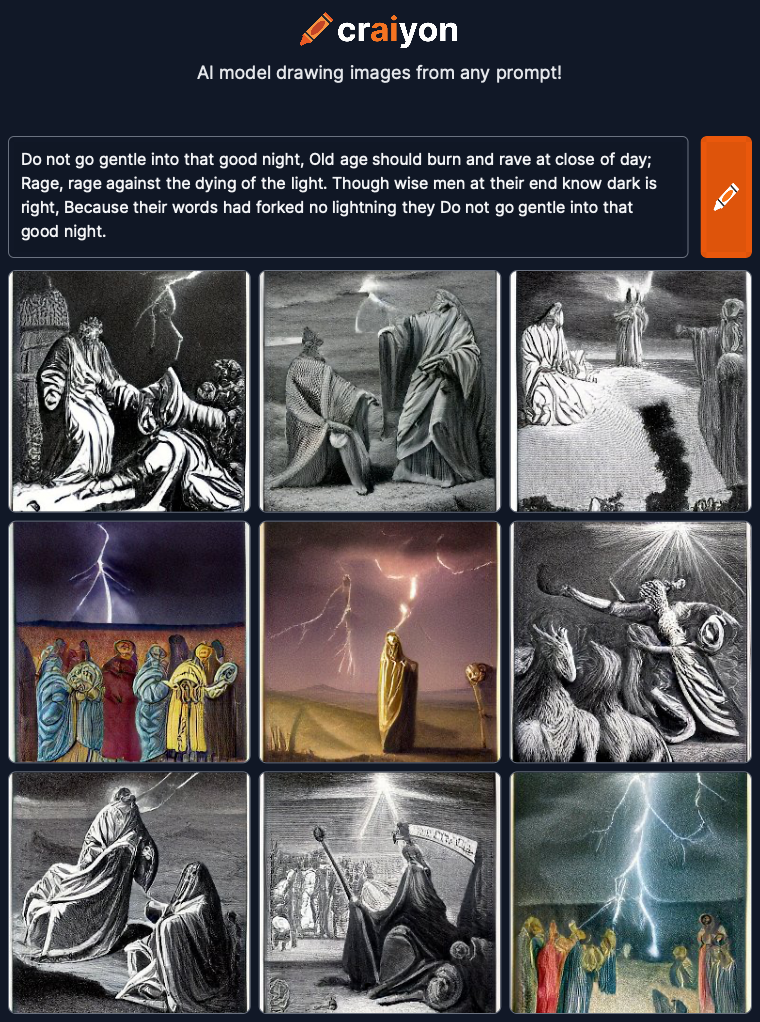
Going with some Dylan Thomas today. Thought the opening lines of “Do not go gentle into that good night” might be worth a go:
Do not go gentle into that good night,
Old age should burn and rave at close of day;
Rage, rage against the dying of the light.Though wise men at their end know dark is right,
Because their words had forked no lightning they
Do not go gentle into that good night.
DALL-E generated 4 options again:

Do not go gentle into that good night – 1

Do not go gentle into that good night – 2

Do not go gentle into that good night – 3

Do not go gentle into that good night – 4
DiffusionBee threw up what looked like a Norse word cloud:

Do not go gentle into that good night
Unimpressed with this, I added a “by Banksy” style modifier to see if this created something more visually arresting. I guess it did. Messing about with styles (drawing, visual, pen, carving and etching, camera, color, emotions, style of an artist or community, CGI software, and CGI rendering) is where I may have to add more direction.

Banksy Style
So, I added a bunch of modifying styles. I then learned that DiffusionBee limits the number of text characters for the prompt. After removing a few, I ended up with this (Angry, Melancholic, Oil Paint, Dramatic, Surrealist):

Angry, Melancholic, Oil Paint, Dramatic, Surrealist
Again, Craiyon gets appropriately angsty. Will have to try something more placid tomorrow:

Craiyon
Messing About With AI: Part 1
I signed up and/or downloaded several AI image-generating services recently. For kicks, I have started to post poetry and descriptions from classic novels to see what the results are. I started the process using one of the most celebrated poems ever: Catullus 85:
Ōdī et amō. Quārē id faciam fortasse requīris.
Nesciŏ, sed fierī sentiō et excrucior.
There are many English translations and interpretations, so I went with Wikipedia:
I hate and I love. Why I do this, perhaps you ask.
I know not, but I feel it happening and I am tortured

It looks like this request may not follow our content policy.
So, I posted this into DALL-E. The word “torture” was flagged as not appropriate, so I went with Google’s stock translation (which was accepted):
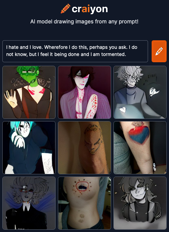
I hate and I love. Wherefore I do this, perhaps you ask.
I do not know, but I feel it being done and I am tormented.
DALL-E generated 4 options:

Catullus 85 – 1

Catullus 85 – 2

Catullus 85 – 3

Catullus 85 – 4
Options one and two are cheerfully banal, but three and four have a slight spark. Option three is my winner. And DiffusionBee seems to follow the same tack, generating this one image from the original text (no issues, it seems, with the word torture):

Catullus 85 – DiffusionBee
Craiyon‘s output definitely felt more teenage angsty. Their AI obvious has the machine soul of a poet:

Catullus 85 – Craiyon
Will try again tomorrow with something completely different.
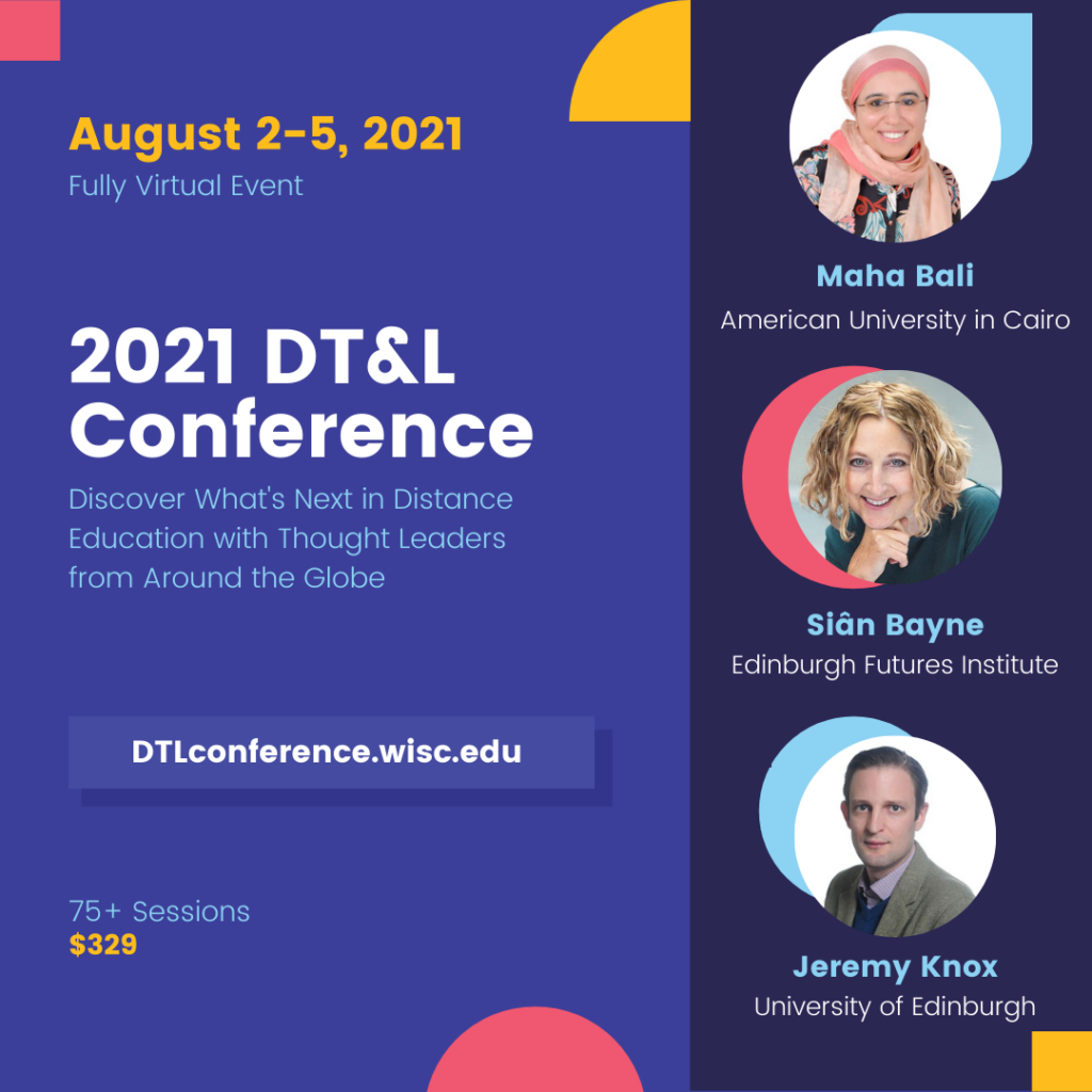
DT&L Conference Registration Opens April 14

The Distance Teaching & Learning Conference (@UWMadison #UWdtl) is 100% online, and runs 2nd – 5th August, 2021.
Registration is just $329.00 for 75+ sessions from internationally-renowned Online and DistanceEd experts.
More information can be found at https://dtlconference.wisc.edu