Tag Archives: Curt Bonk

My MOOC Life (So Far)

I have cautiously been circling MOOCs (Massive Open Online Courses) recently. The educational media has been all over the trend to create an appropriate platform and populate with courses, and “mainstream media” has started to pay attention too. My fear is that MOOCs will be viewed as a silver bullet to the plethora of problems that education in general faces. Most likely there will be a MOOC bubble. 
However, MOOCs are moving education in the right direction. Faculty, instructional designers, software engineers, and students are generously donating their time and attention to craft courses and reusable learning objects that are intended to be easily understood and utilized in a scalable fashion. Things could of course become too commoditized and homogenous, but MOOCs are starting to deliver the promise that opencourseware failed to deliver.

Anyway, my firm belief is that you only truly learn from doing (and making mistakes), so I signed up for some MOOCs. 

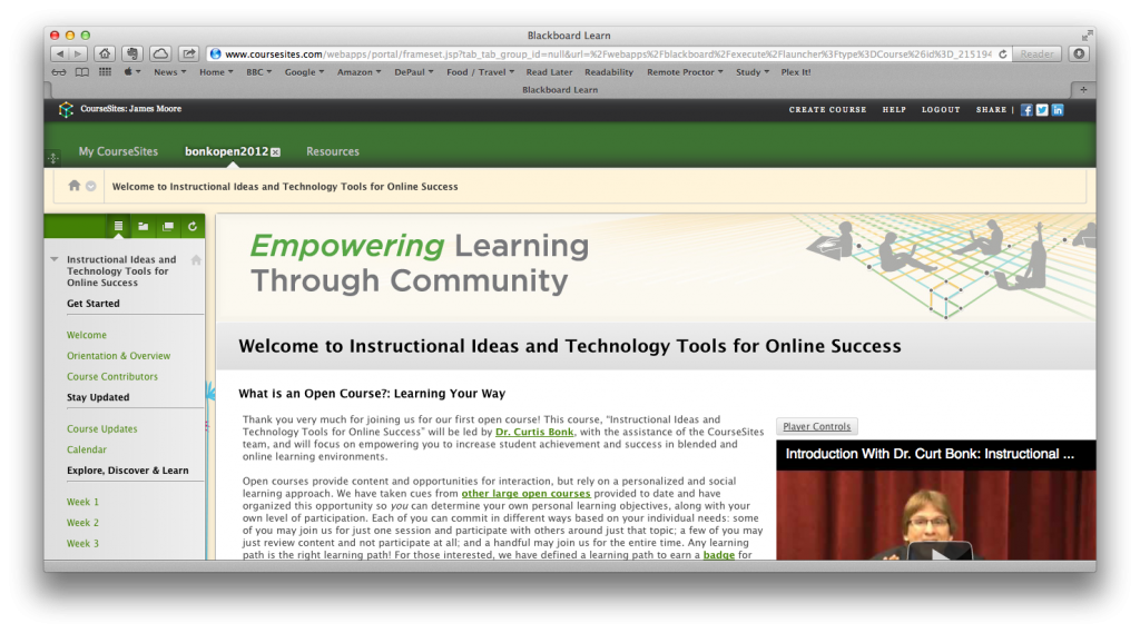
I started with Instructional Ideas and Technology Tools for Online Success. Here I really appreciated and enjoyed the content (from Curt Bonk), but met some frustration with the delivery system. In working through the material I felt that my view that Desire2Learn is a superior LMS to Blackboard was validated. I felt that Blackboard constrained navigation and communication. I felt that Blackboard was more of a document repository than a system that facilitated teaching and Learning.

Instructional Ideas and Technology Tools for Online Success

Instructional Ideas and Technology Tools for Online Success

The course had an accelerated schedule, a five-week duration rather than eleven weeks or longer. This was to be my undoing as I got really, really ill twice during the course. I lost two weeks, and with other commitments I could not catch up. However, the course is still open, and I will endeavor to finish all of the assignments. The content and readings in the course were very helpful. I also made some new contacts via Twitter and Google+ along the way.

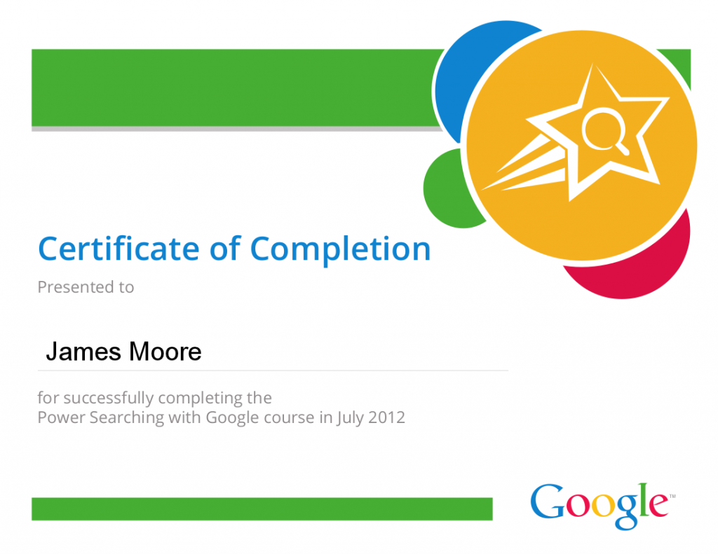
Power Searching With Google

Power Searching With Google

My next MOOC was Google’s “Power Searching With Google.” Google is a company that I like and admire, but it sometimes frustrates me immensely. My frustration in this situation was that the course was unnecessarily ugly. The content, videos, transcripts and exercises were great, but the aesthetic was like an out-of-town factory store -a functional big box that was effective and efficient, but depressing to view. Google’s relentlessly puritan view of engineered effectiveness depresses me. I wish that the company would sometimes make their products look beautiful.

As with many other MOOCs, entering into the discussion area had a tendency to be overwhelming – just keeping track of the conversations was impossible. However, judicious use of search and tags was of use.

Internet History, Technology, and Security

Internet History, Technology, and Security

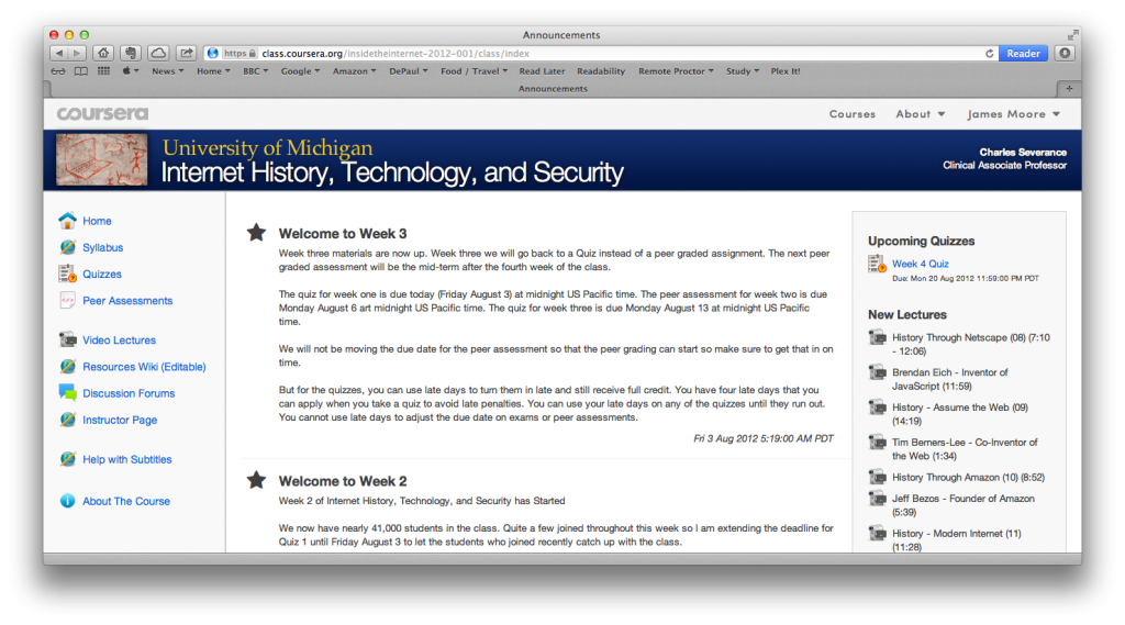
My current MOOC is Coursera’sInternet History, Technology, and Security,” taught by Charles Severance (@drchuck). This is a seven-week course, one in which I arrived late (but not too late). This is a course in which the professor is (by his own admission) inventing along the way, but the structure and material works very well. I have not taken any other Coursera courses, so I don’t know if the instructional design of this course is used in other Coursera courses, but here are a few of the things that have impressed me:

  • The LMS used supports the vast number of students exceedingly well. Video is streamed  and downloaded without a hitch. The navigational scheme is well designed, I have not experienced any disorientation looking for materials.
  • Video is available in both streaming and downloadable versions.
  • Video is generally short, and has embedded quizzes.
  • Students are collaborating on providing transcripts (in multiple languages).
  • The course looks nice. This might sound like a trivial statement, but many online courses are ugly. A pleasant environment is, to my mind, helpful in learning.
  • There are physical office hours. The instructor is travelling around the U.S., and posts office hours for various coffee shops along the way. This is an excellent way for students to actually get to meet each other and their instructor. Luckily Chicago was one of the destinations, and I got to participate.
Cousera Office Hours

Cousera Office Hours

Like other MOOCS there is the inherent issue of assessing learning. So far there have been two strategies employed:

  1.  Automatically graded quizzes. Ten questions are posed for each assessment, which are based on the week’s materials. The questions are drawn randomly from a larger pool of questions, and students can take the quiz multiple times (highest score is preserved). However, students have to wait ten minutes after taking a quiz to retake.
  2. Peer assessment. So far there has been one written assignment. After submitting the written assignment, students are provided with five assignments to grade via a structured rubric. The rubric is largely binary, which simplifies grading. Students are able to provide written feedback and suggestions to their peers. The system works well. There has been at least one instance of a student plagiarizing extensively from Wikipedia – I am interested to see if a plagiarism detection system (like Turn-it-In) could be added.
Next and Continue

Next and Continue

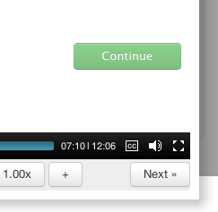
There is one minor flaw that I have encountered in the MOOC, and that is the “Continue” and “Next” buttons in the videos. The videos have embedded quizzes – these pause the video and present the student with questions. After successfully answering the question the student can proceed by clicking on “Continue.” However, the “Continue” button is very close to the “Next” button…. The “Next” button is part of the video player, and Fits Law being what it is, I have a tendency to click on this rather than “Continue.” This results in me navigating to the next video in that week’s content, rather than continuing through the video that I was watching. I silently curse and backtrack when this happens (I think others have encountered the same issue, so the “Continue” button is in green).

Charles Severance has thoughtfully provided some statistics on student participation. I found this information to be very interesting:

  • Enrolled: 42935
  • Watched at least one lecture: 22651
  • Took Quiz 1: 11402
  • Submitted the Peer-Graded Assignment: 5808

My views on MOOCs at the moment are that they are here to stay. A business model has not been established, but I am sure one will evolve. I don’t think traditional universities are going to be hurt by MOOCs, but this may hurt the publishing industry. A MOOC is essentially an interactive book, so why buy a textbook or manual when you can take a MOOC that covers the topic for free?
MOOC Week 0, Going Into Week 1 (#Bonkopen)

I am currently taking an online course, or rather a MOOC (Massively Open Online Course) this month. Full disclosure, I know the instructor, and have blogged about Curt before.

The course (Instructional Ideas and Technology Tools for Online Success, taught by Curtis Bonk) has just started, and each week we are invited to blog about our experiences. This is my first post and covers Week 0, running into Week 1.

Reasons For Enjoyment

I am enjoying the course, and that is due to a couple of features. The primary reasons for my enjoyment to date are:

  • Week 0: The course has an introductory week, which I both admire and appreciate. Even though I have experience of Learning Management Systems (and online course design), the first time in any new course provides a degree of confusion. Like walking into a building for a first time, a quiet period for orientation is required to know exactly where to go and how to get there.
  • Effective use of video: Online courses can be a little text-heavy. I appreciate using video to communicate with students.
  • Icebreakers: There are 3000+ of us in the course. I know I won’t be able to read all of the introductions, but I feel like I am getting to know others in the course. Acceptance of Social Media. Conversation is also taking place outside of the LMS, using social media tools. Tags help aggregate the conversation (such as this one: #Bonkopen).
  • Synchronous and Asynchronous content: My preference is to asynchronous courses, which allow me to better manage my time, but the knowledge that there are (optional) synchronous elements helps push me to meeting deadlines.
  • Weekly email reminders: I am fairly organized, but regular prompts help me stay on schedule.

Reasons For Taking The Course

I am taking this course for two reasons:

  1. To improve my knowledge and level of expertise, to as to better advise faculty who are teaching online.
  2. To improve the two online courses I am teaching later this year.

Study Environment and Options

Taking this course has been very helpful in changing my perspective – merely by being an online student again. I have a plethora of devices on which I can study and collaborate, but limited windows in which I can study. The times at which I can study are:

  • Early morning: 5 – 6 a.m. (before everyone else in the house is up)
  • On the way to work: 7 – 8 a.m. (On the El)
  • On the way back from work: 5 – 6 p.m. (On the El)
  • Last thing at night: 10 – 11 p.m. (everyone else in the house has gone to sleep)

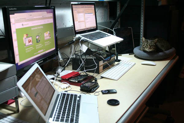
The past week was a good opportunity to experiment with how well I could study at these times, and on the devices and in the environments made available to me. Here are the devices I use:

Dual Macs

Dual Macs

Mac with dual monitors. In a quiet room at home (basement), this is the idea machine and environment in which to study and collaborate. The dual monitors allow me to place content on one screen, and write on the other screen. My home Internet connection is decent enough so as not to frustrate me whilst downloading and uploading, but this environment does not come with me…

MacBook Air

MacBook Air

MacBook Air. Carried with me near everywhere. The screen is tiny, which can be a bit of a pain, but the device is lightweight and a pleasure to use. My cellphone provides a precarious Internet connection for the laptop whilst travelling on the El. If the train is not too crowded, I can get some work done on the Air on the way to and from work.

N900

N900

Nokia N900 Cellphone. This aging device (has been my primary ‘phone for about three years) has an unlimited EDGE dataplan. Not the quickest device, but can get the job done. Has a great browser, nice screen, and keyboard. Lacks a spellchecker…

iPod Touch

iPod Touch

iPod Touch. Second generation. Essentially an iPhone without the Phone. Again, my cellphone provides a precarious Internet connection whilst travelling on the El.

iPad

iPad

iPad. First generation. Essentially a super-sized iPod Touch. Again, my cellphone provides a precarious Internet connection whilst travelling on the El. Works best for consuming content rather than creating content. I don’t take it with me as often as the MacBook Air.

My Bold Plan

My bold plan was to see how well I could operate as a mobile student – accessing the CourseSites course whilst on the move. So far this has not worked as well as I might have hoped, but this is good. Mild frustration helps point out things that I could change in future courses (or at least prepare students for).

Mild Frustrations and Observations

Here are the issues I ran into along the way (sometimes just because I was looking for things to break):

1: Reading PDFs

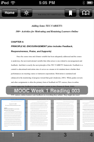
Reading PDF on the iPod Touch Kindle did not work for me

Reading PDF on the iPod Touch Kindle did not work for me

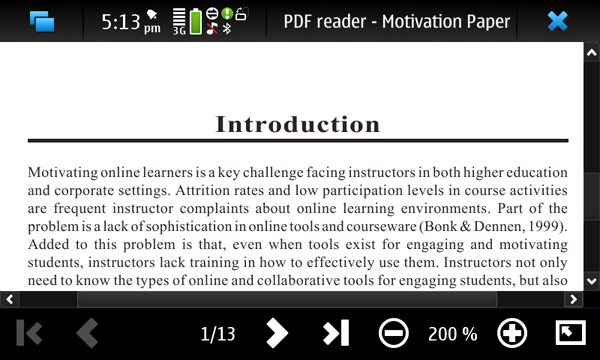
My first day of class I downloaded the PDF reading assignments to my laptop. I knew I was going to be travelling home on a packed train, so iPad and laptop use were not an option. Instead I thought I would use my iPod Touch to read the PDFs, so I sent them to the device via Amazon’s Send To Kindle service before leaving work’s WiFi cloud. This approach did not work for me, as the PDFs were too small to read on the screen (and I could not rotate the screen to read in landscape mode).

Reading PDF on the cellphone – not fun, but it worked

Reading PDF on the cellphone – not fun, but it worked

Reading PDF on the cellphone – not fun, but it worked

My fallback was to open the PDF with the cellphone – this worked, but reminded me how PDFs can sometimes be a pain to work with.

Lessons Learnt (for future courses)

When providing PDF handouts, provide the content in other formats that can be read more easily on mobile devices. HTML or epubs would have let me scale up the content to be legible on a device with a small screen. The issues here is whether this can be legally done, or if the content in the PDF can be easily converted.

2: CourseSites Navigation

I found the layout and the organization of the course to be logical and efficient, but there is one aspect of Blackboard CourseSites that I found frustration – that is navigation to components of the course. One of the first assignments is to introduce yourself via the discussion board, but the directions to do that are less than ideal:

Use the link above to introduce yourself and share your expectations for the course.

Use the link above to introduce yourself and share your expectations for the course.

Where the link is the heading (Discussion: Let’s Get to Know One Another). My frustration here is that the link is not apparent (no visual cues, beyond the mouse pointer changing form when hovering above the link). A better solution would be contextual links within the body of the text, for example:

Introduce yourself and share your expectations for the course through the discussion board.

(where discussion board is the linked text)

I think this is a constraint imposed by CourseSites, rather than a design decision.

Lessons Learnt (for future courses)

Ensure that navigation is contextual.

3: Mobile Applications

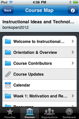
Using CourseSites on the iPod Touch

Using CourseSites on the iPod Touch

I did experiment with the Mobile Learn iOS app, but ultimately found using the browser on my cellphone to be an easier approach. Interaction did not work well on the mobile apps.

Lessons Learnt (for future courses)

Review online courses on a mobile device, and decide whether the app/LMS affords easy navigation and collaboration

4: Video Content

Lastly, there is one suggestion for improvement that I would suggest. I really enjoyed the video content, and that it was hosted on YouTube. This allowed for some collaboration and commentary to take place outside of the MOOC (which is a great idea). What I did not like was that I had to open a separate window to view the video outside of the LMS, my suggestion would be to embed the YouTube video in the LMS and provide a link to the YouTube page (for those who wanted to comment interact with the video directly from YouTube)

Lessons Learnt (for future courses)

Embed video.

Time For Bed…

Anyway, that is me for this post. This was more my thoughts and reactions to the LMS and instructional design. My next blog post will be about the actual reading and reflection (i.e. learning) that I am following in this course.