Tag Archives: mobile

Finding The Perfect Folding/Travel Keyboard for My iPhone

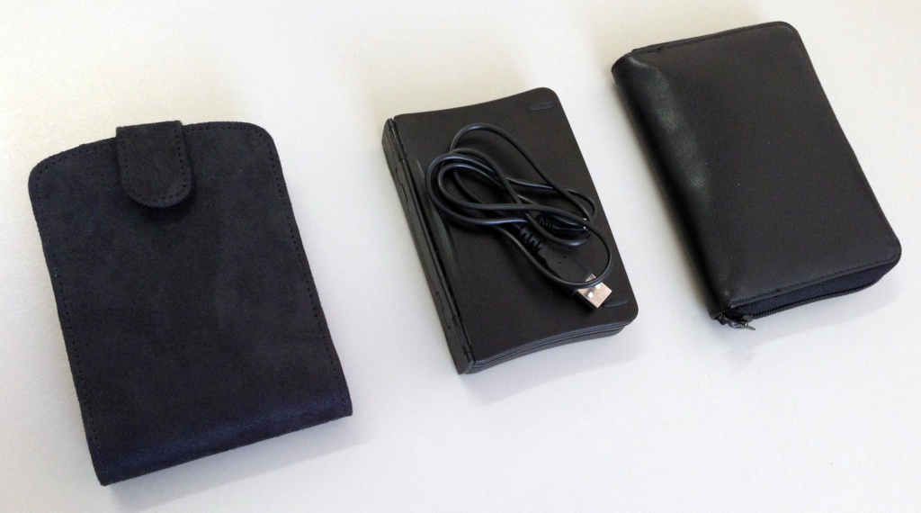
The Three Folding Keyboards

The Three Folding Keyboards

Much as I like my iPhone, I miss having an actual keyboard – something that I can actually type on and see the full screen. Something that I can use my than just one finger to type with. For the past few years I have waited for what I thought would be the perfect folding keyboard…

http://youtu.be/Ss9Vd4lukDs

This could have been the Jorno. A folding Blutooth keyboard with an engaging design. However, the keyboard is still in prototype stage even though it was fully funded on Kickstarter back in October of 2012. Many of the backers are irate, and asking for refunds. The original design (which was the most exciting feature) has been greatly simplified. If it ever gets shipped I doubt that this will work terribly well.

iGo Stowaway Ultra-Slim Bluetooth Keyboard

iGo Stowaway Ultra-Slim Bluetooth Keyboard

So I have been looking at alternatives. I still have my old iGo Stowaway Ultra-Slim Bluetooth Keyboard that I bought back in 2006. This works well, but is not entirely ideal – it does not lie entirely flat on a table, and the number keys require pressing the function key to work. The technology is impressive, but using it can be painful. I wanted to see if there was something better out there.

GEYES GK108 Folding Keyboard

GEYES GK108 Folding Keyboard

On Amazon, I found the GEYES GK108 Folding Keyboard. This is essentially the old Targus PA830U Stowaway Portable Keyboard, but with a USB cable interface. This will work with an iPhone 5 providing I use an Apple iPad Camera Connection Kit and a Lightning to 30-pin Adapter. The GEYES GK108 uses a proprietary USB cable which I worry about losing. This is by far my favorite keyboard to type on, but having to carry the cable and adapters makes this an option I am less likely to use.

Reudo Folding Keyboard

Reudo Folding Keyboard

This is going to be my keyboard of choice. The Reudo Folding Keyboard is not quite as pleasant to type on as the GK108, but it is almost as good. The Reudo Folding Keyboard is not quite as compact as the Stowaway, but it is almost as good. It comes in a little case, with a folding stand for iPhones and small tablets. The notable ways in which it is clearly better than the competition are the shortcut keys on the keyboard that work extremely well on the iPhone, and the fact is uses Bluetooth 3 and did not need a PIN. This will be coming with me everywhere I take the iPhone (or a tablet).

Folded, Bagged and Tagged

Folded, Bagged and Tagged

Update: Geyes Bluetooth 3.0 Triple Folding Wireless Keyboard

Geyes Bluetooth 3.0 Triple Folding Wireless Keyboard

Geyes Bluetooth 3.0 Triple Folding Wireless Keyboard

Brandon Davis emailed me to say that he had found a Bluetooth version of the GK108 Folding Keyboard on Amazon. This looks like it comes with a pouch and a phone stand as well. This could be a better option than the Reudo for my uses. Thanks Brandon!

Brandon also suggested the Vivitar 60316 Compatible USB Cable as a replacement cable for the one that comes with the GEYES GK108 Folding Keyboard.

Interactive Moto X Advert in Wired Magazine

Wired

I am a Wired Magazine subscriber. The somewhat asinine aspect of this is that you still have to receive the paper magazine in the mail even if you just want to read via the iPad app. For this reason, the physical magazines typically end up getting recycled (or given to a friend) without being read. However, in an idle moment I flipped through an old issue and saw a rather nifty advert for the Moto X….

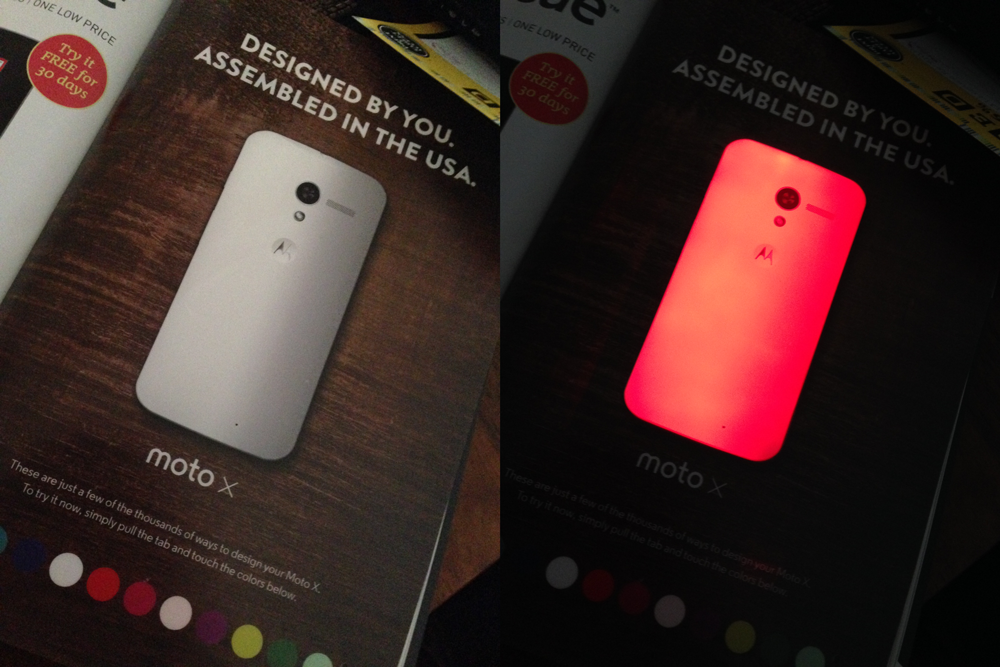
Moto X Advert (Before and After)

Moto X Advert (Before and After)

What looked at first to be a simple image of the smartphone was in reality a page in which you could change the colors of the ‘phone cover by pressing a button on the page. My curiosity go the better of me, and I pulled apart the page to see how this worked. Sandwiched between two pages was plexiglass, LEDs, four batteries, and various wires and contacts (buttons). The buttons allow you to change the back of the  Moto X – the LEDs able to shine with eleven colors

The guts of the advert

The guts of the advert

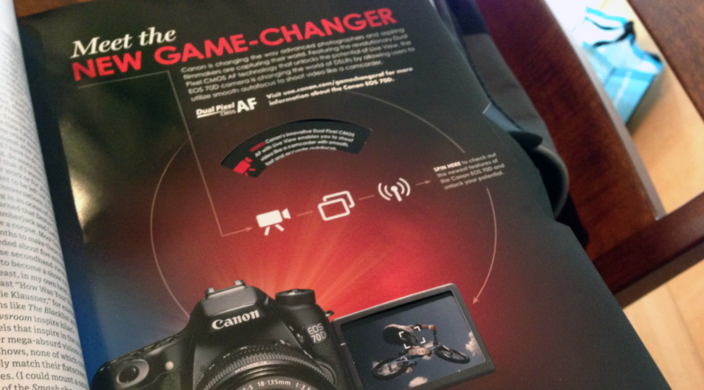
Apparently about 150,000 readers received the advert, so this was not cheap for Motorola to put together (but Google has the cash). Whilst I cannot say that this made me think more favorably about purchasing the Motorola ‘phone,  I did think it amusing that the interactive advert of the Canon EOS 70D (a paper wheel, that fell off the page rather than spinning) looked somewhat shabby in comparison.

Canon EOS 70D

Canon EOS 70D

The “designed by you” campaign reminds me too much of “The Homer” – the car designed by Homer Simpson…

The Homer

The Homer

Adobe Seminar (Exploring Creative Cloud for Enterprise)

Adobe Pen and Book

Adobe Swag

I attended the Adobe Seminar (Exploring Creative Cloud for Enterprise) this morning. At the event I and a colleague asked these two questions:

  1. Where can faculty (who may be intimidated by the Adobe resources for creative professionals) get documentation on how to use the Creative Cloud programs? i.e. Where can you get info on the fundamentals?
  2. Where can faculty get and see examples of best practice in education using the Creative Cloud programs?


The answer to question one was:

https://helpx.adobe.com/creative-cloud/learn/tutorials.html
(and click on Fundamentals)

The answer to question two was:

http://edex.adobe.com
Adobe Education Exchange. Membership is free, but needs an Adobe ID.

Adobe Education Exchange also has a series of MOOCs (providing a certificate) that train educators in the various tools. This is something I highly recommend. I plan on enrolling when I have time…

Brief Notes

I jotted down some brief notes from the seminar, which I share here…

The focus of the morning was on Adobe Creative Cloud, but Adobe Marketing Cloud was mentioned in passing (analytics, social, media optimization, targeting, etc.). I have not looked at this in the past, but should do so soon.

Adobe Creative Cloud was positioned as being good value to the user, with upgrades being released more frequently,  instead of the traditional release cycle. Somewhat ironically, we could see some updates being applied to one of the presenters’ machine during the keynote

Photoshop

Photoshop warping was demonstrated by Rick Borstein, which allowed for some very clever manipulations of images. Not something I will most likely use, but fun to watch in action. Linking was more likely, which allowed for non-destructive changes. We saw a Camera RAW filter in action, then some 3D Modeling in which 3D files were grabbed from another application, manipulated, with then the option to export directly to Shapeways, print to one of the MakerBot 3D printers, or save as an STL file.

Illustrator

Corner editing applied to multiple assets simultaneously was shown in Illustrator, along with a new pencil tool which used fidelity settings. We saw a perspective view which now allowed for the moving of station points, and non-destructive editing of text, then free transformations.  Brushes are now easier to work with, and images can be used as a brush.

InDesign

Most of the Adobe products have a dark (black) interface and background, but in InDesign now allows the user to change interface, so that things look a little more upbeat. The program is now able to work with right to left scripts (i.e. Arabic script). Fonts have improved search options/filtering (search entire name) with the option to favorite up to ten fonts. With hyperlinks, the character styles are automatically applied, and InDesign validates that URL is correct. Impressively  it can create QR codes natively – with subtle effect like change colour and scale (this I liked). You can also save InDesign files as older versions (to work with collaborators on older versions of software),  but some options may not be editable.

Making the Mobile Web Work

Andrew Trice (Technical Creative Cloud Evangelist), then spoke about “Making the Mobile Web Work.” He started off with some demonstrations of sites not working well on mobile devices, or sites expecting users to change behavior (i.e. the orientation of their iPad). He then showed mobile designed sites which looked truly awful on desktop machines (huge buttons and text). He was of the opinion that touch targets get very hard on smartphones if you have to keep on zooming in and out (to which I am in agreement) – this is not an optimal experience….

Muse

Muse was was earlier described by Rick Borstein as being InDesign for the Web, with the option to create animations in  HTML 5.

Andrew explained that Muse was designed from the same team that worked on InDesign, so the design metaphors were similar. For an InDesign user, Muse would be intuitive and familiar. Muse has an extensive choice of fonts, but can rely on web-safe fonts. Integration with Adobe Web fonts is possible.

Muse can publish as HTML, or export into Dreamweaver.

Responsive Design

Andrew positioned Responsive Design as taking two paths:

  1. Create a dedicated version for each device/platform (i.e. site optimized for desktop, another site optimized for mobile)
  2. CSS rendering on-the-fly.

Muse can export HTML for each supported platform, and follows approach #1.

Andrew then recommended Adobe Generator for Photoshop CC, and the use of  layers from Photoshop to generate assets (you can decide whether these will be png or jpeg, along with the appropriate sizes).

Edge Reflow

Reflow is a responsive design tool, which created appropriate CSS via media queries for breakpointed versions of a site. This allows the use to create different size versions of a site, which display elegantly on various devices.

EdgeCode

EdgeCode is a branded version of Brackets, and allows for quick changes of CSS and code, with the ability to preview immediately. It is a plugin for very rapid development. I liked it.

Premier and Audition

The session ended with demonstrations of Premier and Audition. I am pretty happy scraping up quick-and-dirty videos with ScreenFlow, but this is something I will look at eventually.

The morning was helpful. I did not win the iPad Mini that was given away, but was still happy to be there. The MakerBot examples were extremely impressive too.


Resuscitating (and repurposing) the old Nokia N900

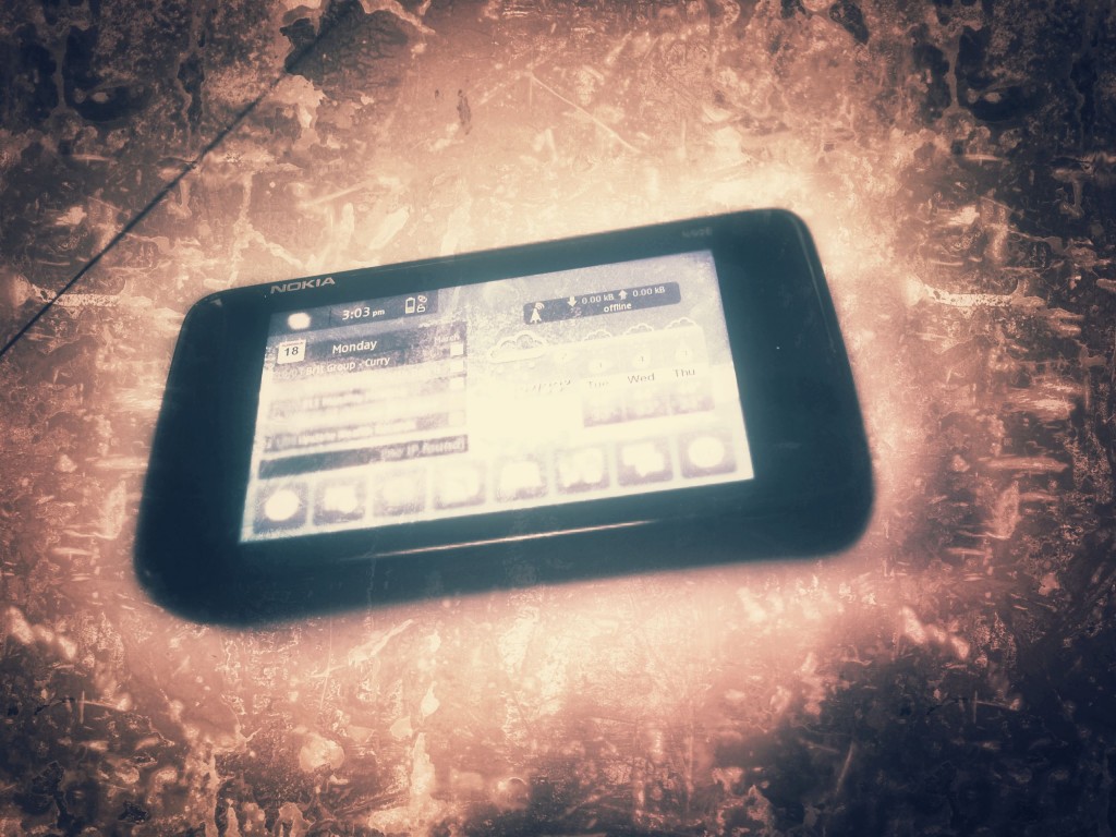
Nokia N900

Nokia N900

I migrated to an Apple iPhone 5 a while back. Even though the ‘phone is lacking a keyboard (which my old Nokia N900 had) I am fairly happy with the device. However,  I sort of need for a portable speaker, and rather than buy a Jawbone JAMBOX (or equivalent) I think I can repurpose the N900.

Over on Maemo.org Sabrog has a useful piece of script for activating the earphone socket as a line-in:

Speaker ON

#!/bin/sh
amixer -c0 set PCM 100%
amixer -c0 set 'Right PGA Bypass Mixer HP Switc' on
amixer -c0 set 'Left PGA Bypass Mixer HP' on
amixer -c0 set 'Left PGA Mixer Line1L' on
amixer -c0 set 'Left PGA Mixer Line2L' on
amixer -c0 set 'HP PGA Bypass' 100%
amixer -c0 set 'Speaker Function' On
echo "Speaker is ON"

Speaker OFF

#!/bin/sh
amixer -c0 set PCM 100%
amixer -c0 set 'Right PGA Bypass Mixer HP Switc' off
amixer -c0 set 'Left PGA Bypass Mixer HP' off
amixer -c0 set 'Left PGA Mixer Line1L' off
amixer -c0 set 'Left PGA Mixer Line2L' off
amixer -c0 set 'HP PGA Bypass' 0%
echo "Speaker is OFF"

Thanks Sabrog!


DEPD 0330 Reflection

I an currently taking an online course (DEPD 0330 Learning in the Mobile Age) via  the University of Wisconsin-Madison Distance Education Professional Development Program, and this is my time to reflect.

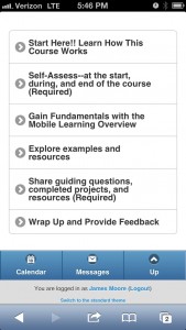
Moodle Course on iPhone

Moodle Course on iPhone

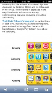
I have consciously attempted to study on a plethora of mobile devices (iPhone 5, iPad 3, Nokia N900, and Apple MacBook Air). The experience has been pleasant, and I have been impressed by how well the Moodle site has rendered on mobile devices. In some ways the navigational process has been more pleasant on an iPhone, where much of the structure has been abstracted. The only times I have wanted to return to using a laptop (which is still a mobile device) have been where images were difficult to view on the phone, or now, when I needed to type something up that was more than a few paragraphs in length.

Larger Images Did Not Work So Well On A Mobile Device

Larger Images Did Not Work So Well On A Mobile Device

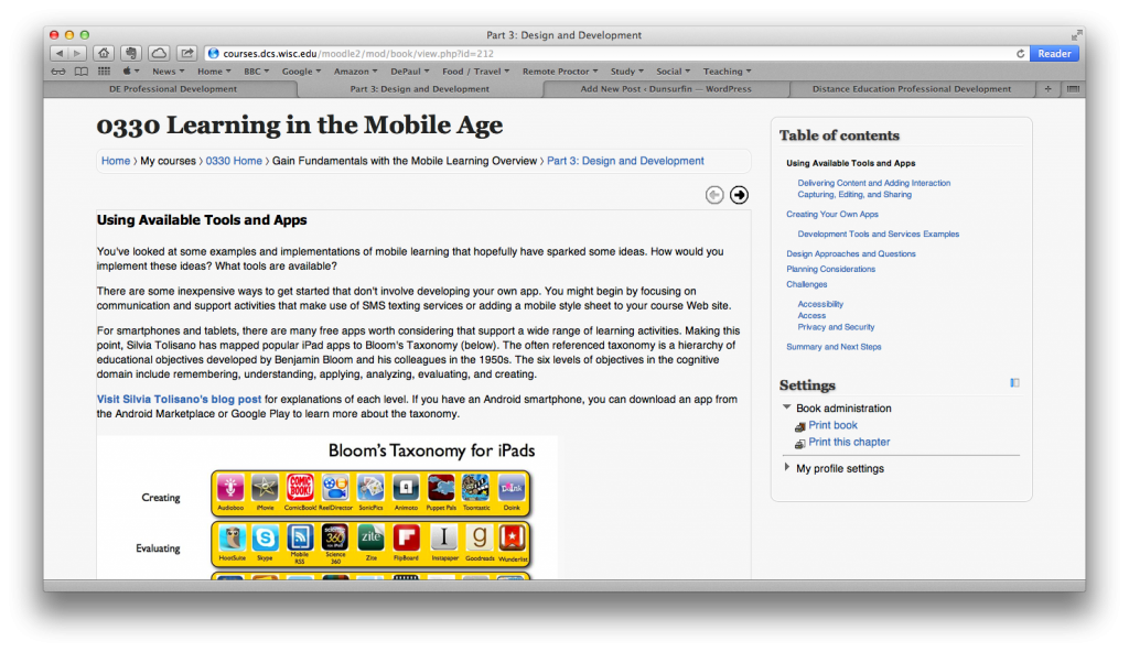
The resources that have been particularly useful to me in this course were in Part 3 (Design and Development), where a list of applications and ideas were listed for mobile student activity. Some of these I was already using, but others will be explored. These resources will be used in the classes I teach, and shared with my colleagues at work.

Part 3: Design and Development

Part 3: Design and Development

I liked how various “chapters” of the courses could be collated and printed as a PDF. This will allow me to explore these resources after the course had finished, but my ideal situation would have been to save everything as an ebook (epub or ibook).

The course has introduced the concept of a guiding question, defined here as:

“A guiding question is the fundamental query that directs the search for understanding.” (Traver, 1998, p. 70)

My guiding question is one I have pondered for a while – how should one communicate with online students? Essentially I am looking for the ideal delivery platform for instructional materials that lasts beyond the course. A Learning Management System is a powerful platform, but once a course is over students no longer have access to the contents. Communicating over the Internet is efficient and extensible, but students do not always have continuous access to the Internet. I need something that works beyond these limitations.

I think my guiding question is still relevant based upon the ideas and material I have encountered in the course.  In some ways this has become more relevant, as during the course I experienced times in which I wanted to study but did not have Internet access. An ideal platform for study would have (perhaps) been something analogous to a service like EverNote, which provides a local copy of resources on digital device, but syncs when connected to the Internet.

The guiding question will continue beyond the life of the course, but the course has introduced new tools and perspectives that will help me approach a workable solution to the problem.